New hobby!
Mar. 28th, 2019 03:04 pmOne of the reasons I've been so busy for the past couple of months is that I decided to finally take a calligraphy class. It took a lot more of my time than I had anticipated, but I really enjoyed it and I want to continue with it.
Background:
I've always been interested in calligraphy, and that comes from my father. Despite being aesthetically challenged, even more so than me (he was a mechanic and could build anything for utility, but it would be the ugliest thing without any concept of polishing the rough ends), he loved handwriting and geometry and was skilled in both calligraphy and drafting. He started very early - I have his high school yearbook which he personalized on the inside cover with gorgeous black and yellow (his school colors) blackletter - and in the days before home computers and printers, he would do things like write out place cards for dinners and parties.
I don't remember actually talking to him about his work, but I loved watching him work and seeing the results. While I was in elementary school, he taught me compass-and-straight-edge geometry and I used to draw patterns with them. In middle school, I took a mechanical drawing class, which taught me how to use a drafting board and T-square, as well as the importance of precision and presentation. I remember that in high school, I tried to learn calligraphy and failed miserably. My father tried to teach me the basics, but I never really grokked what he was trying to tell me and I got very bored of practicing very shaky lines and circles.
I've made a couple of attempts to learn over the years, but it's difficult to self-teach from a book, especially when you don't have the tools or the environment. Well, I've finally created the environment - a desk in my room set aside for projects - and I saw the class listed in the continuing education section of the local community college's catalog, so I decided to go for it. The class promised to teach how to write in the uncial hand and how to draw Celtic knots.
Now, three months later (a bit longer than expected, as the snows closed the school for a week so we had make-up classes), I'm pretty happy with the results. The instructor was pretty good - very talented and encouraging, and my only quibble with her was that she assumed too much basic knowledge on the student's part and she wasn't good at coming up with alternate explanations if someone didn't understand the first time. For example, she kind of glossed over the importance of the width of the pen with respect to the size of the letters, which caused a number of the people in the class to spend the first couple of weeks frustrated that their letters looked spidery. When asked about it, she repeated her explanation a couple of times, and they never really understood. As for me, I was able to use my own experience with drafting and calligraphy and my father's instructions to fill in the blanks. (I was very impressed with the instructor's ability to critique positively. Rather than pointing out, "This is bad and this is why," she would say, "This could be improved like this."
One thing that I had to learn (and still don't get) was how to incorporate what I would call "art" into the writing. Many of the examples of things we could do for our projects included watercolor backgrounds, leaf presses, ombre lettering, etc. - all things I neither know how to do nor have any interest in. I love the writing, but really don't have any interest in, say, writing a saying on a background or with flowery embellishments. But I tried my best to learn to use watercolors and gouache, with limited success.
So, here are my results, with some discussion of what we were trying to learn. Of course, most of my projects were related to Doctor Who, to my instructor's amusement.
Images and discussion:
All thumbnails are clickable for larger images.
Uncial is an early script used primarily in the fourth to eight centuries, with its roots in Greek writing. It is entirely capital-letter. Probably the most famous work written in Uncial is the Book of Kells. It's written with a broad-edge pen and is characterized by round, wide letters. It's actually a pretty easy hand to start with because 1) it's only capitals, so no lowercase to worry about, 2) it has a fixed pen angle for the most part, and 3) it's written straight up and down, not slanted.
We started out by learning the shapes of the letters through monoline uncial, which is basically writing in an uncial style using a regular, non-broad-edge pen. This was really helpful, since I didn't have to battle with learning to use the pen correctly while also trying to learn the strokes. Also, one of the things I learned from this is that you can practice this anywhere - I spent the time in meetings at work writing out the names of all the modern DW episodes in monoline uncial. But that's the thing: you need to explore the shapes of the letters to discover what looks good and what doesn't, and get your hand used to them. In broad-edge calligraphy, an "o" is written with two strokes. We're not used to this from normal writing.
All of the assignments were to be done on a specific type and size of paper so that we would bind them into a book at the end of the term. The first assignment was to lay out and write a phrase using monoline uncial, and decorate it using broad-edge Zig calligraphic felt pens.
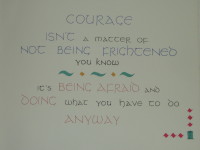
In the second week, we started working with broad-edge pens, which takes some work, as you not only need to learn to work with the pen, but you also have to learn to load it with ink without having it blob all over the place. Luckily, I already had some experience with this, so it wasn't so bad for me.
We started with learning the round letters (O, D, E, G, P, Q) and the straight up-and-down letters (F, I, J, L, T), because those are the basic shapes you should learn first - the O and the I. Letters with diagonals are actually more difficult, in part because they require changes in pen angle. The assignment for that week was a mix of more monoline uncial and borders with what's called an O-chain, which is the letters in alphabetical order separated by Os. This helps you concentrate on getting the Os consistently shaped while also placing them among other letters.
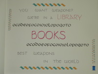
In the third week, we learned the rest of the letters. This was more difficult than it should have been, as I missed it when the instructor mentioned that the pen angle on the N is radically different than it is for any other letter, so my Ns look terrible for a couple of weeks. Also, for some of the letters, such as the Y, the different lines in it have different pen angles.
The instructor also introduced basic watercolor concepts, including how to mix colors and how to write a letter with one color and drip another color into it. The assignment was to "experiment with color", and I tried, I really did, but I had no idea what I was doing and ended up chickening out, choosing to just write with different color inks. I have a lot of fountain pen inks, so I used those, and learned why fountain pen inks are really not suited for dip pens.
One of the students in the class is the art teacher at a local high school, and another is an established watercolor artist. They produced the most gorgeous pieces. (Well, to be honest, the teacher's pieces were great, while the artist's art was beautiful, but her calligraphy was not as good. She deviated a lot from the full, round uncial we were learning, and probably would have done better to have taken the italic class instead.)
My boring piece. It's not bad, hand-lettering-wise. It could use more work on the layout.
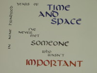
I don't remember the point of the fourth week of class, but the assignment was another "play with color" assignment, so I tried a lot harder to do that, at the expense of the lettering, it turns out. You can see that the letters are slanted a bit forward, which is a no-no for uncial. The lettering is black gouache; the big word is black gouache with red gouache dripped into it (it looks a lot better in person). The dots are watercolor, and the diamonds are Zig broad-edge felt pens.
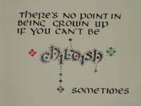
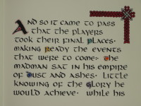
The fifth week of class was my favorite: Celtic knots. The instructor taught is how to draw a very simple 2x3 knot, and my mathematical mind just latched onto it. The assignment was to write a full page of text - she wanted us to concentrate on practicing lots of letters - and include a small, simple knot in it. I spent the week drawing knots and experimenting with them, then did my assignment.
What I wanted was to make something similar to a page from the Book of Kells - nice knotwork embellishment of a paragraph of text - and this is easily my favorite of the things I produced for this class. The Book of Kells has decorated capitals at the beginning of each sentence, but the text I chose had big long sentences, so I just embellished a few of the more important nouns. I would love to make a book of some short story like this someday.
Interestingly, I was the only person in the class who did what the instructor said - lots of words. Everyone else had a basic knot or two on the page and one short sentence. The art teacher did a gorgeous piece that said, "I will KNOT make a pun", with a ribbon of knotwork through the word "KNOT".
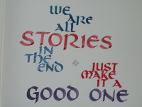
And in week six, the piece that I hate the most. The concept here was to work on layout - how to arrange the words to make them pretty, use tracing paper to overlap them, etc. You can see that not only is the lettering unsteady and unbalanced, but the layout is wonky. I made a mistake and wrote "just" on the wrong line, about an inch too low, and I didn't have the time to redo the whole piece, so everything got pushed down and it was just all bad.
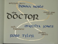
The instructor actually never gave us an assignment for week seven, to be brought in on the last class to be bound into the book. It's probably a good thing, since only one other person actually showed up, oddly enough. But I wanted to keep practicing, so I made the following. I had originally wanted it to be a list of the Doctor and companions with the actor names written over them in gold, but I was having too many problems learning to write with the gold watercolors (they take a special technique) and couldn't do it reliably. Then I laid out what you see with just the Doctor, Donna, Martha, and Rose, intending to make a word cloud of Tenth Doctor characters and concepts, but realized that would take too long. So I created this. I think I want to redo this with a watercolor background of blue drybrush, so that it's kind of like on a space backdrop.
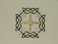
And then, the night before class, I thought I'd make a knot. It took me four hours to do the sketch and to paint it in with gouache and silver and gold watercolor. It's now the cover of my bound book.
And that's it. I'm now trying to keep up my skills with Uncial, experimenting with drawing knots, and starting to learn italic. (I'm particular to blackletter, but it's much more difficult than and nowhere near as useful as italic, so I'm starting there first.) I have to keep at it, because I bought so many supplies over the course of the class and it would be a waste if I didn't use them. ;) So now I have yet another hobby to take up my time. I'm also thinking about creating a blog, to document my learning and exploration, because I found, while searching for calligraphy instruction on the web, experts write a lot about what to do but have forgotten the stuff that beginners might trip over. I might be able to provide pointers to beginning calligraphers. We'll see if I get up the motivation to do that.
(Does anyone know how to take pictures like this so that they don't come out so dark? I took these with my camera, with a flash, and they're still so dark.)
Background:
I've always been interested in calligraphy, and that comes from my father. Despite being aesthetically challenged, even more so than me (he was a mechanic and could build anything for utility, but it would be the ugliest thing without any concept of polishing the rough ends), he loved handwriting and geometry and was skilled in both calligraphy and drafting. He started very early - I have his high school yearbook which he personalized on the inside cover with gorgeous black and yellow (his school colors) blackletter - and in the days before home computers and printers, he would do things like write out place cards for dinners and parties.
I don't remember actually talking to him about his work, but I loved watching him work and seeing the results. While I was in elementary school, he taught me compass-and-straight-edge geometry and I used to draw patterns with them. In middle school, I took a mechanical drawing class, which taught me how to use a drafting board and T-square, as well as the importance of precision and presentation. I remember that in high school, I tried to learn calligraphy and failed miserably. My father tried to teach me the basics, but I never really grokked what he was trying to tell me and I got very bored of practicing very shaky lines and circles.
I've made a couple of attempts to learn over the years, but it's difficult to self-teach from a book, especially when you don't have the tools or the environment. Well, I've finally created the environment - a desk in my room set aside for projects - and I saw the class listed in the continuing education section of the local community college's catalog, so I decided to go for it. The class promised to teach how to write in the uncial hand and how to draw Celtic knots.
Now, three months later (a bit longer than expected, as the snows closed the school for a week so we had make-up classes), I'm pretty happy with the results. The instructor was pretty good - very talented and encouraging, and my only quibble with her was that she assumed too much basic knowledge on the student's part and she wasn't good at coming up with alternate explanations if someone didn't understand the first time. For example, she kind of glossed over the importance of the width of the pen with respect to the size of the letters, which caused a number of the people in the class to spend the first couple of weeks frustrated that their letters looked spidery. When asked about it, she repeated her explanation a couple of times, and they never really understood. As for me, I was able to use my own experience with drafting and calligraphy and my father's instructions to fill in the blanks. (I was very impressed with the instructor's ability to critique positively. Rather than pointing out, "This is bad and this is why," she would say, "This could be improved like this."
One thing that I had to learn (and still don't get) was how to incorporate what I would call "art" into the writing. Many of the examples of things we could do for our projects included watercolor backgrounds, leaf presses, ombre lettering, etc. - all things I neither know how to do nor have any interest in. I love the writing, but really don't have any interest in, say, writing a saying on a background or with flowery embellishments. But I tried my best to learn to use watercolors and gouache, with limited success.
So, here are my results, with some discussion of what we were trying to learn. Of course, most of my projects were related to Doctor Who, to my instructor's amusement.
Images and discussion:
All thumbnails are clickable for larger images.
Uncial is an early script used primarily in the fourth to eight centuries, with its roots in Greek writing. It is entirely capital-letter. Probably the most famous work written in Uncial is the Book of Kells. It's written with a broad-edge pen and is characterized by round, wide letters. It's actually a pretty easy hand to start with because 1) it's only capitals, so no lowercase to worry about, 2) it has a fixed pen angle for the most part, and 3) it's written straight up and down, not slanted.
We started out by learning the shapes of the letters through monoline uncial, which is basically writing in an uncial style using a regular, non-broad-edge pen. This was really helpful, since I didn't have to battle with learning to use the pen correctly while also trying to learn the strokes. Also, one of the things I learned from this is that you can practice this anywhere - I spent the time in meetings at work writing out the names of all the modern DW episodes in monoline uncial. But that's the thing: you need to explore the shapes of the letters to discover what looks good and what doesn't, and get your hand used to them. In broad-edge calligraphy, an "o" is written with two strokes. We're not used to this from normal writing.
All of the assignments were to be done on a specific type and size of paper so that we would bind them into a book at the end of the term. The first assignment was to lay out and write a phrase using monoline uncial, and decorate it using broad-edge Zig calligraphic felt pens.

In the second week, we started working with broad-edge pens, which takes some work, as you not only need to learn to work with the pen, but you also have to learn to load it with ink without having it blob all over the place. Luckily, I already had some experience with this, so it wasn't so bad for me.
We started with learning the round letters (O, D, E, G, P, Q) and the straight up-and-down letters (F, I, J, L, T), because those are the basic shapes you should learn first - the O and the I. Letters with diagonals are actually more difficult, in part because they require changes in pen angle. The assignment for that week was a mix of more monoline uncial and borders with what's called an O-chain, which is the letters in alphabetical order separated by Os. This helps you concentrate on getting the Os consistently shaped while also placing them among other letters.

In the third week, we learned the rest of the letters. This was more difficult than it should have been, as I missed it when the instructor mentioned that the pen angle on the N is radically different than it is for any other letter, so my Ns look terrible for a couple of weeks. Also, for some of the letters, such as the Y, the different lines in it have different pen angles.
The instructor also introduced basic watercolor concepts, including how to mix colors and how to write a letter with one color and drip another color into it. The assignment was to "experiment with color", and I tried, I really did, but I had no idea what I was doing and ended up chickening out, choosing to just write with different color inks. I have a lot of fountain pen inks, so I used those, and learned why fountain pen inks are really not suited for dip pens.
One of the students in the class is the art teacher at a local high school, and another is an established watercolor artist. They produced the most gorgeous pieces. (Well, to be honest, the teacher's pieces were great, while the artist's art was beautiful, but her calligraphy was not as good. She deviated a lot from the full, round uncial we were learning, and probably would have done better to have taken the italic class instead.)
My boring piece. It's not bad, hand-lettering-wise. It could use more work on the layout.

I don't remember the point of the fourth week of class, but the assignment was another "play with color" assignment, so I tried a lot harder to do that, at the expense of the lettering, it turns out. You can see that the letters are slanted a bit forward, which is a no-no for uncial. The lettering is black gouache; the big word is black gouache with red gouache dripped into it (it looks a lot better in person). The dots are watercolor, and the diamonds are Zig broad-edge felt pens.

The fifth week of class was my favorite: Celtic knots. The instructor taught is how to draw a very simple 2x3 knot, and my mathematical mind just latched onto it. The assignment was to write a full page of text - she wanted us to concentrate on practicing lots of letters - and include a small, simple knot in it. I spent the week drawing knots and experimenting with them, then did my assignment.
What I wanted was to make something similar to a page from the Book of Kells - nice knotwork embellishment of a paragraph of text - and this is easily my favorite of the things I produced for this class. The Book of Kells has decorated capitals at the beginning of each sentence, but the text I chose had big long sentences, so I just embellished a few of the more important nouns. I would love to make a book of some short story like this someday.
Interestingly, I was the only person in the class who did what the instructor said - lots of words. Everyone else had a basic knot or two on the page and one short sentence. The art teacher did a gorgeous piece that said, "I will KNOT make a pun", with a ribbon of knotwork through the word "KNOT".

And in week six, the piece that I hate the most. The concept here was to work on layout - how to arrange the words to make them pretty, use tracing paper to overlap them, etc. You can see that not only is the lettering unsteady and unbalanced, but the layout is wonky. I made a mistake and wrote "just" on the wrong line, about an inch too low, and I didn't have the time to redo the whole piece, so everything got pushed down and it was just all bad.

The instructor actually never gave us an assignment for week seven, to be brought in on the last class to be bound into the book. It's probably a good thing, since only one other person actually showed up, oddly enough. But I wanted to keep practicing, so I made the following. I had originally wanted it to be a list of the Doctor and companions with the actor names written over them in gold, but I was having too many problems learning to write with the gold watercolors (they take a special technique) and couldn't do it reliably. Then I laid out what you see with just the Doctor, Donna, Martha, and Rose, intending to make a word cloud of Tenth Doctor characters and concepts, but realized that would take too long. So I created this. I think I want to redo this with a watercolor background of blue drybrush, so that it's kind of like on a space backdrop.

And then, the night before class, I thought I'd make a knot. It took me four hours to do the sketch and to paint it in with gouache and silver and gold watercolor. It's now the cover of my bound book.

And that's it. I'm now trying to keep up my skills with Uncial, experimenting with drawing knots, and starting to learn italic. (I'm particular to blackletter, but it's much more difficult than and nowhere near as useful as italic, so I'm starting there first.) I have to keep at it, because I bought so many supplies over the course of the class and it would be a waste if I didn't use them. ;) So now I have yet another hobby to take up my time. I'm also thinking about creating a blog, to document my learning and exploration, because I found, while searching for calligraphy instruction on the web, experts write a lot about what to do but have forgotten the stuff that beginners might trip over. I might be able to provide pointers to beginning calligraphers. We'll see if I get up the motivation to do that.
(Does anyone know how to take pictures like this so that they don't come out so dark? I took these with my camera, with a flash, and they're still so dark.)